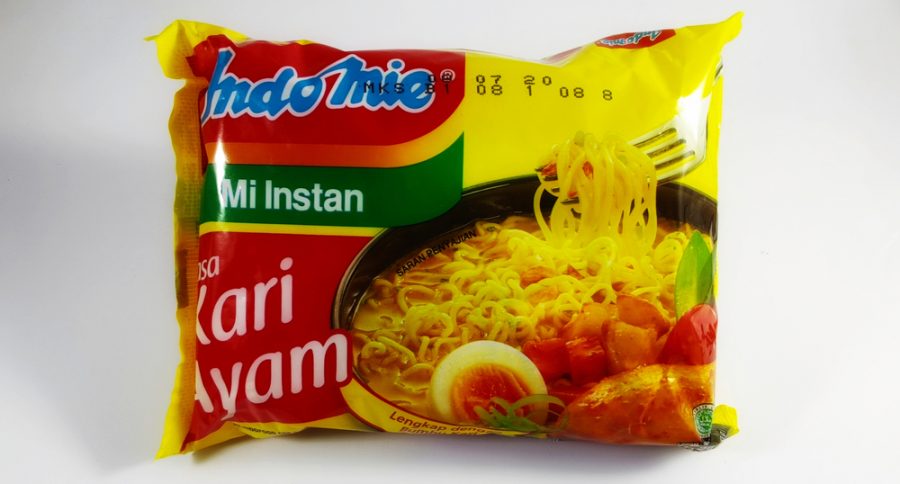
Noodles are a staple food across Asia. However, it is not limited to just one continent. Its ease of cooking and taste has made it a popular sound around the world. Like every other best food packaging inspiration, noodle boxes are meant to keep them in perfect form before consumption. A good packaging design will help the brand improve its name and assure quality. It’s a definite plus if it is also nature friendly since a lot of people prefer that. Noodle packaging design differ based on the type of noodles. And hence, their qualities and features vary as well. brands have to come up with various designs, depending on the type of noodle.


As a customer, everyone is guilty of judging a book by its cover. With such wide competition, brands need to introduce a wow factor in their design to attract customer attention. The primary purpose of noodle packaging is to bring in customers and keep the noodles safe. A good noodle packaging also engages the customer and encourages them to buy your product. Having a design that is creative, and different helps your business connect with your customers. Ultimately, this will make a great difference in the overall perception and sales. To make the best noodle packaging, several factors need to be kept in mind.
An innovative and standout noodle packaging. It has a flavorless biofilm that is made from kitchen ingredients. The standout feature of this packaging is that on boiling, the package itself turns into a sauce. The herbs and flavoring are in the packaging and contact with hot water turns it into a sauce. Not only is this highly innovative but it is also a great alternative to plastic packaging which has a high negative impact on the environment.
An instant noodle packaging design for kids. The package is designed in the form of a simple cup. Its front is dominated by its logo, a helmet, which is also what kabuto means. The pack comes in different colours depending on its type. The chicken variant has yellow colour while the vegetarian variant has a green colour. The Package has a few taglines on the front around the logo along with the name of the variant below it.
A popular brand with an iconic design. Maggis‘ design is highly colourful displaying a bowl of cooked noodles on a wooden background. Its small packaging is compact and easy to carry. The left bottom is printed with a nutritional value chart and the center has the name of the noodle in bold letters. The intelligent use of green colour throughout the packaging drives home its vegetarian nature.
A full green package emphasizes its organic nature. The noodles are made out of wheat which is written on the front. The packaging has the brand logo on the top right corner with the full name beside it. Its bottom right corner is littered with text putting focus on its certified organic nature. The packaging is simple and to the point. It also has a large leaf printed on the front which is filled with images of raw noodles.
A packaging design aimed toward kids and adults alike. It has a bright green background which brings contrast to the rest of the package. The band logo is in the center on a red triangle that covers the top two corners. An illustration is also put just below the logo with an image of cooked Yippee noodles on the right. Yellow squiggly lines are used to write the variant of the noodle in the center. The package is press packed with a continuous triangular shape to help open it easily.
A cup noodle packaging with a very large textualized brand name on the front. The rest of the cup is filled with a batch of four squiggly lines that form a square in various orientations. Besides, the brand names are various certifications and features of the cup noodles. It comes in various colours depending on its flavor. The packaging is sturdy and does not deform on entering hot water. The top of the package is sealed with a cover that slants just off the top. This allows the customer to easily open up the noodle instead of cutting it out.
The packaging oozes of its premium nature and its minimalistic design immediately grabs attention. The message is simple and clear with the brand name on the top and an image of the cooked noodle below it. The packaging is colour coding according to the ingredients in it. Its minimalistic nature makes it very pleasing on the eye.
Konjac noodles have a unique elongated pentagonal design. Its top is sealed off but is very easy to open from the gap in its side. It has a white colour and a speck of other colours depending on its flavor. The brand is emphasized in the middle with the flavor written on top. An image of the vegetable is at the button depending on the flavor.
Also read – Best Pizza Packaging Design Ideas
We at VOWELS are highly proficient at making a noodle box according to your exact requirements. Our designs are eye-catching and inspiring. Our designs are specifically tailored based on the type of noodle. From cup noodles to instant noodles, we design packaging for all. Our premium quality packaging provides you with the best of the best and our team is ready to support you 24/7. With our highly efficient production line, you will have your customized noodle packaging delivered to you within weeks. So don’t hesitate, to contact VOWELS today to get a unique design for your noodles.


I'm a business strategist and brand consultant who helps brand solve their business problems through developing competent experiences driven by insights from diagnosing leadership mindset. Need help with your brand? — Get in touch


