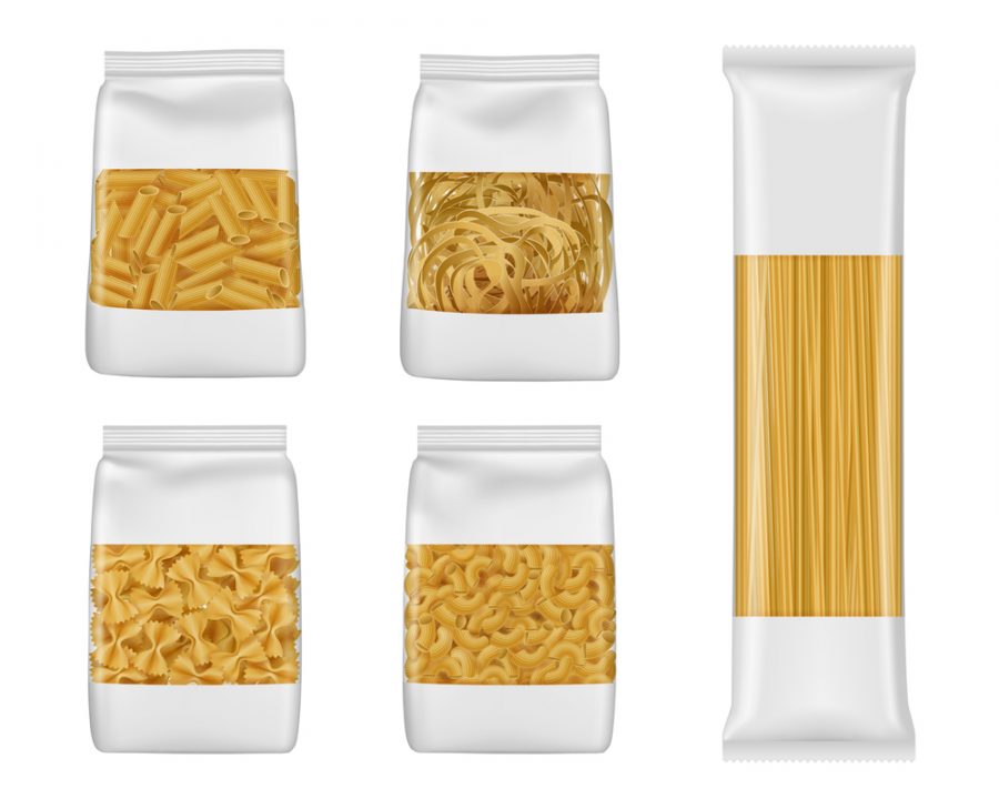
Pasta is always in high demand among consumers. Not only at home, but pasta remains a hot food item even in cafes, restaurants, hotels, and eateries. It’s hard not to love it. After all, how can someone not love this card-rich delicacy? It also helps that there are endless options to choose from too. Another thing about pasta is that everyone has a different association with different types of pasta. Different types of food packaging designing create unique experiences for customers. And the same goes for pasta packaging. The color, typography, and illustrations speak volumes about the type of pasta in the package. With a market of highly varied demographics, brands can easily experiment with packaging.
Also read: Food Packaging Ideas »
Besides creating a brand association, pasta packaging also has some other vital functions. To win over the customers, brands not only need to focus on the color and illustrations but the quality of packaging material as well. Even if you design your package in the most attractive way possible, customers are unlikely to prefer it if it feels cheap and flimsy. Here are some of the key features that all pasta packaging should have.


If you are in the pasta business, you understand how large your demography can be. In such a demanding and saturated market, how do you create a unique identity for your products? Obviously with great packaging for pasta. Using proper techniques when designing your packaging can help you increase your brand recognition and create a solid customer base. Scroll down below to find how some of the world’s top pasta packages are designed.
A highly eye-catching and artistic pasta packaging design. Instead of the traditional box or packet, they’ve gone with a slim jar. The design is on the minimalistic side with a simple tagline taking most of the space. The packaging makes use of colours to create sharp attention-grabbing contrast between its matt black body and fluorescent green cap. The packaging makes smart use of prints to leave space for the display of its content. The matte black and green color give the pasta a very premium feel which is well worth the price.
This cheery and upbeat pasta packaging design uses floral prints to grab the attention of the customer. The purpose of the floral print is to convey the natural feel of the product and create a strong identity based on it. The logo takes the center stage in this design and once again highlights the completely plant-based nature of this pasta. This sort of packaging is sure to resonate with people who are into plant-based products.
A very unique pasta box packaging design. The box is adorned with abstract art that presents the scene of the sky in a forest. More than anything, this design looks like a piece of art. This abstract design is used to emphasize the out-of-the-world nature of the pasta and put focus on its taste and quality. Pasta lovers with a knack for art will find themselves captured by this packaging design.
A simple pasta box packaging adorned in bright red and black. The design is simple and easy with emphasis put on its organic nature. In addition, its other prominent features are also printed on the front along with a picture of cooked pasta. It’s simple design magazines to accurately highlight all its important aspects while remaining easy on the eyes.
For pasta lovers who want to enjoy pasta made from 100% durum, the Lokay pasta is a winner. The brand’s funky bright green pasta packaging bag instantly grabs attention. Keeping the details low on the front, the brand highlights its pure durum nature through a gold text background. The Lokay pasta packaging comes in long packages which are completely recyclable.
The modern and trendy design by Mister Cook is truly unique. Instead of pasta, it comes across as a cup noodle. With its logo squarely in the center on top and a tag on the side, it puts focus on the quality and freshness of the pasta. The background is adorned with fun texts in different fonts that make the design very appealing. Once this pack is in your hands, you cannot help but go through it multiple times.
Bella’s pasta design emphasizes its organic nature but makes the packaging all green. It is smartly highlighted with watermarks of leaves in the background. The large texts on the front put focus on its best features. Bella cleverly uses the tagline above its brand name which is highlighted with a red background. There is also a small cutout to give the consumers a small sneak peek into its contents.
Craft a unique pasta design packaging for your product and show off your pasta’s personality with custom pasta packaging ideas made by VOWELS. At VOWELS, we have professional creative packaging designers who actively collect data and ideas to inspire the next breakthrough in pasta packaging design. We will help you choose the pasta packaging that is right for your product and get you the best prices. With custom printing of the logo, brand name and tagline, you can increase your recognition in the market and improve your sales. Contact VOWELS today and get started on your new pasta packaging.
About Juice Packaging Design »


I'm a business strategist and brand consultant who helps brand solve their business problems through developing competent experiences driven by insights from diagnosing leadership mindset. Need help with your brand? — Get in touch


